Like many organisations EE were looking at efficiencies, one such area was reducing costs for the call centre. I was assigned a project to look at how we could reduce the number of calls to the call centre. This would reduce costs as each time a customer called it would cost the business.
I worked in a team consisting of:
Product owner
Content designer
User researcher
Development team
I was the UX designer/Researcher on this project.
Welcome journey
Problem statement
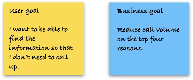
I started the project by understanding the business goals and the user goals. These were based on insight gathered from listening to calls and reviewing call log data. Using the goals a Problem statement was defined:
“Call centres produce a weekly report on the types of calls they were receiving. Some of these were for common tasks such as checking their usage and viewing their bill. How might we reduce call volumes and help customers find the information they need on the app."
Below is the User goal and the Business goal that we as a team decided to focus on.

Competitor review
The next stage we brainstormed ideas. One idea that we chose to explore was the idea of a Welcome journey to help educate customers about what can be done online and in the app.
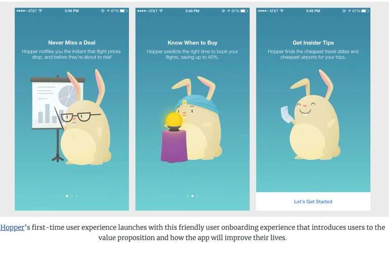
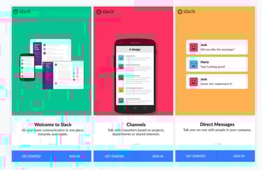
I conducted a competitor review looking at Welcome and Onboarding journeys. This helped shape the layout and the type of information to present.
Below is an example of the competitors reviewed.
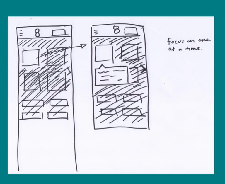
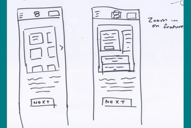
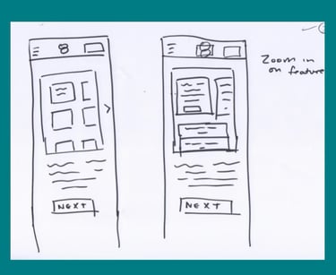
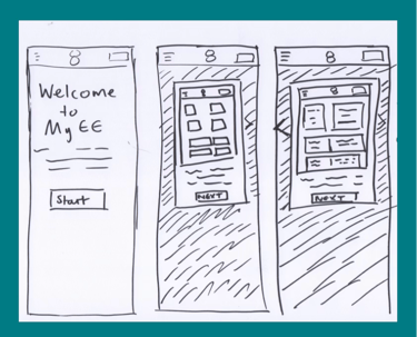
Skectching & Testing
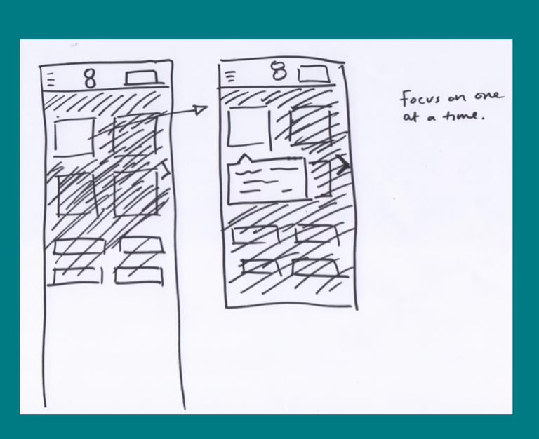
I sketched out some ideas based on the competitor reviews and call reasons. I presented these to the PO. There were 2 variants:
A carousel
Focus view
We were unsure which to proceed with so I decided to test both. I conducted a round of guerilla testing. I Tested with 6 participants and 4 found the carousel more engaging as it was less disruptive.
Below are sketches that were used for guerilla testing.


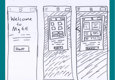
Project challenge
Following the feedback from the usability testing I produced high fidelity screens. These were handed over to the dev teams to build.
A challenge from, the dev team was that they were concerned with loading times on the website as we were introducing animation. I had limited experience regarding this so reached out to the wider design team and a colleague suggested creating GIFFs. This helped reduce loading times and the designs were developed.
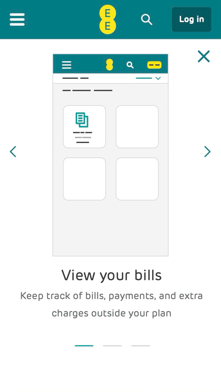
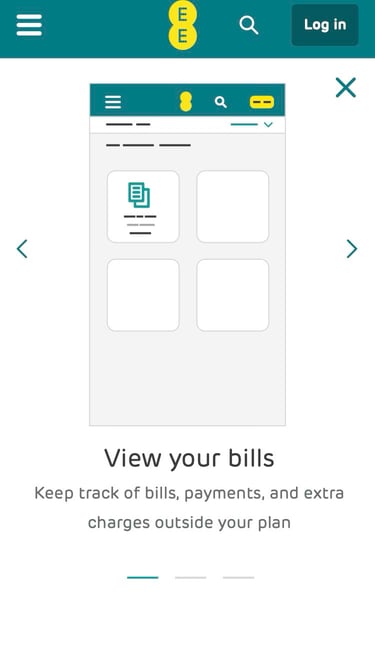
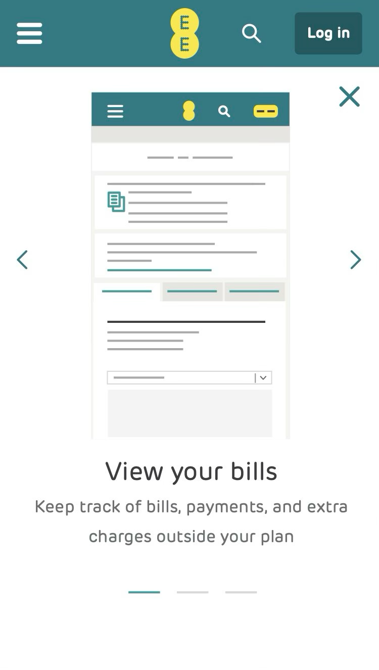
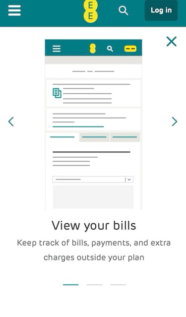
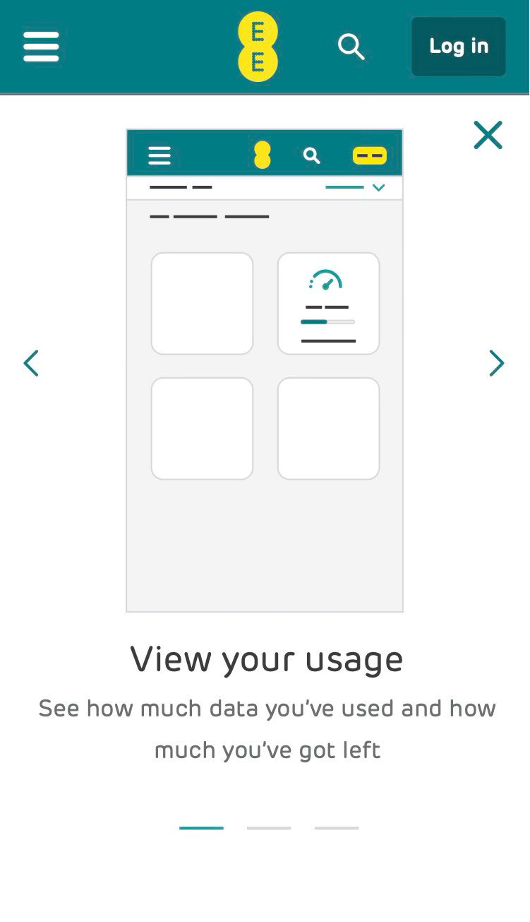
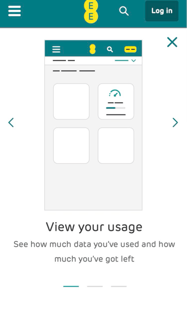
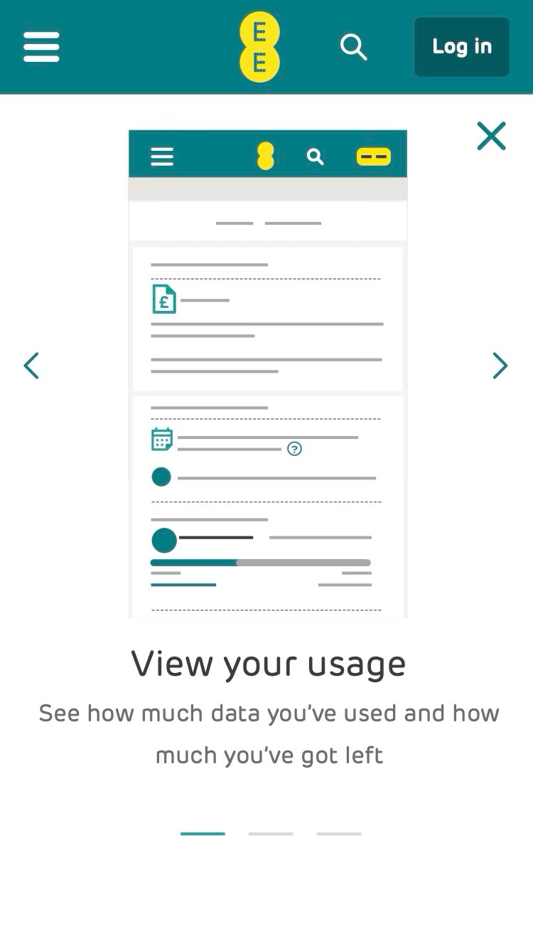
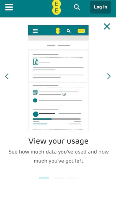
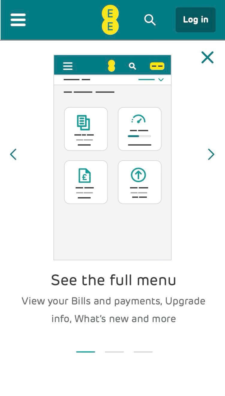
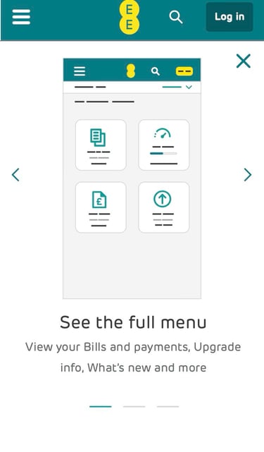
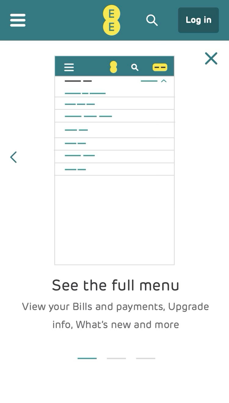
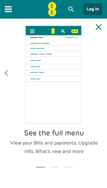
Below are the final designs.
Outcome
Although impact wasn’t immediate, analytics showed a 20% increase in repeat logins to My EE in the weeks following launch—suggesting customers were becoming more confident in self-serving and relying less on call support.