The business identified that customers were not opting in to setting up two step authentication. I was tasked with understanding why customers were not opting in.
I worked in a team consisting of:
Product owner
Content designer
Development team
I was the UX designer/Researcher on this project
Two step authentication
Problem statement
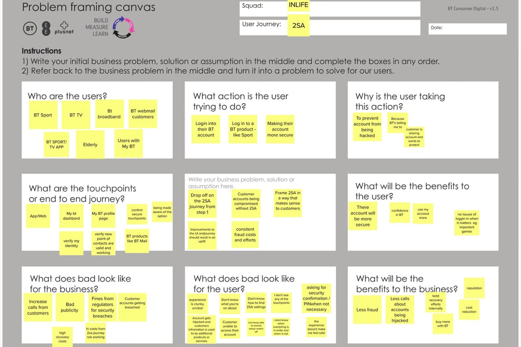
I started the project by working with the team to define a problem statement. A workshop was held and a problem framing canvas was used.
The problem statement defined was:
“We have observed that there is a 70% drop off from customers landing on step1 of the 2SA funnel to completion.
How might we improve 2SA so that our customers are more successful in setting up 2SA? We will measure this with an increase in conversion from the number of customers that go from Step 1 of the 2SA journey to completing the information required for 2SA.”
Below is the Problem framing canvas used.
Challenge
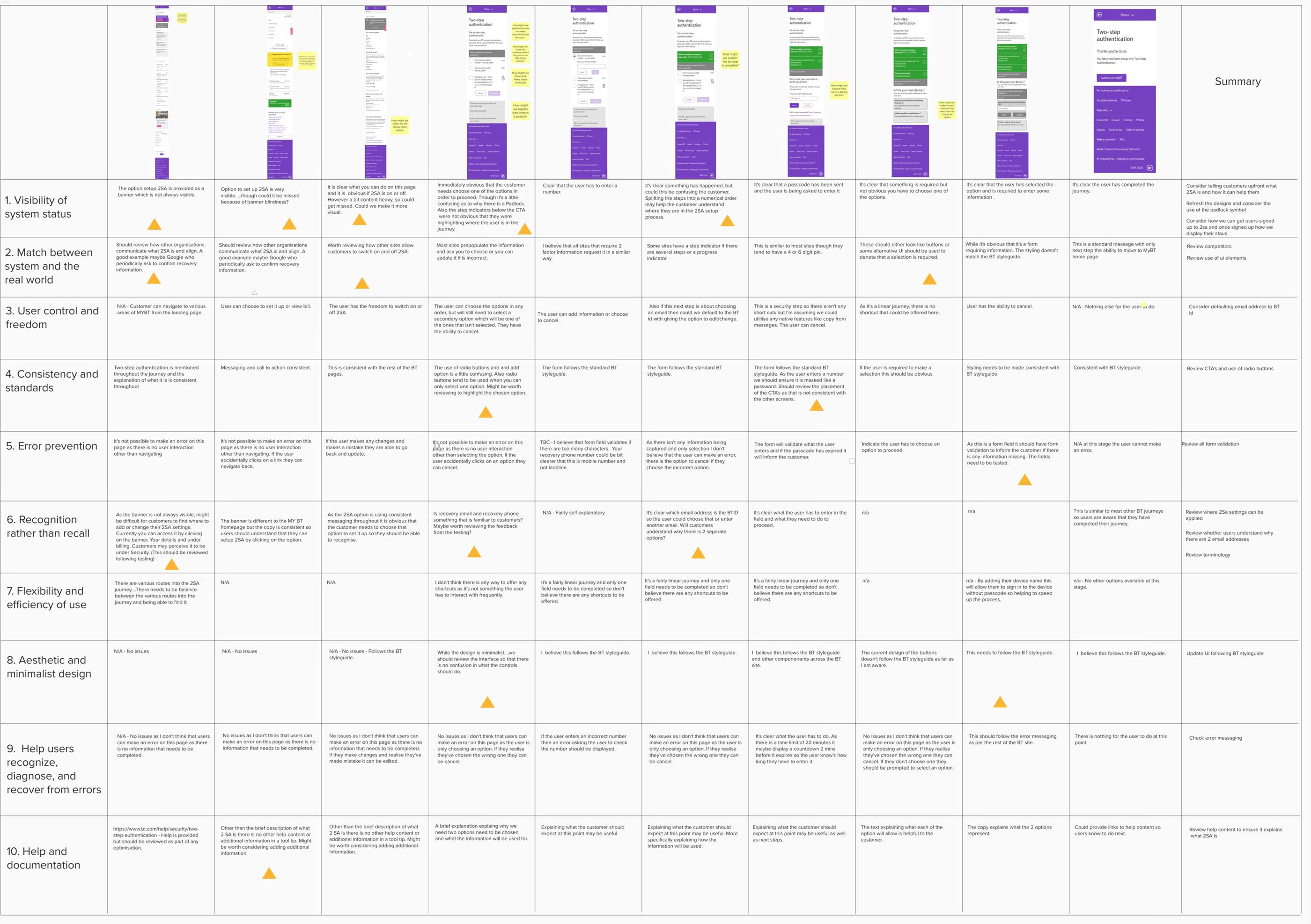
We had a partially tagged journey from a data analytics perspective So we didn’t know what aspects of the journey could be improved. I undertook a heuristic review to identify where there may be issues with the journey.
Below is the output from the Heuristic analysis.
Designing collaboratively
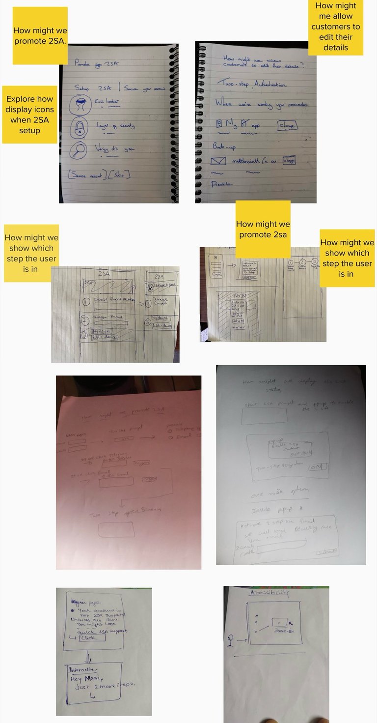
Using the problem statement, reviewing competitors and finding from the heuristic review I arranged a workshop with the team.
We looked at opportunities in the form of How might we statements. Squad members were able to pick how might we statements that they had ideas for. They sketched ideas. We then collectively discussed the ideas and voted on what to take forward.
The image illustrates some of the sketches done by the team.
Usability testing
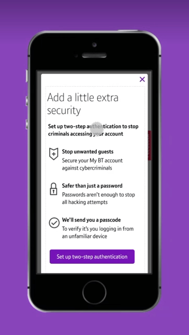
Using the ideas that were discussed I created a prototype. I planned the usability testing session and recruited participants. Research sessions were held over teams, due to remote working. The main findings from the research:
Users were not sure why they were being asked for both an email and mobile number.
The image illustrates one of the screens in the usability test.
The outcome
Feedback from the research was taken on board, however the project was paused as there was wider project looking at consolidating journeys.